Data has become a strategic asset for businesses striving to thrive and compete in the fast-paced realm of modern business. But here’s a twist – raw and unstructured data is a treasure trove of untapped potential. Data in its raw form, no matter how powerful or vast, is like a gold mine waiting to be discovered and excavated. This is where the need for data visualization comes in, facilitating users to extract meaningful patterns and insights from the data deluge. Visualization tools enable a quick transformation of elusive, complex, and overwhelming raw data into a compelling story for everyone in the organization, from the boardroom to the front lines. This may be the reason behind the surging demand for data visualization tools among organizations of all sizes.

With data visualization, an overwhelming number of tools can transform raw data into meaningful insights for actionable decision-making. Amidst many tools for data visualization, Tableau has emerged as a game-changer since it allows anyone to create rich and interactive visualizations without being a data expert. The intuitive interface and drag-and-drop functionality of Tableau democratizes data visualization and bridges the gap between data and decision-making. Furthermore, data visualization with Tableau allows users to turn chaos into clarity and uncertainty into untapped opportunities that position organizations ahead in the dynamic landscape of the digital realm.
Key Features of Tableau That Redefine Data Visualization
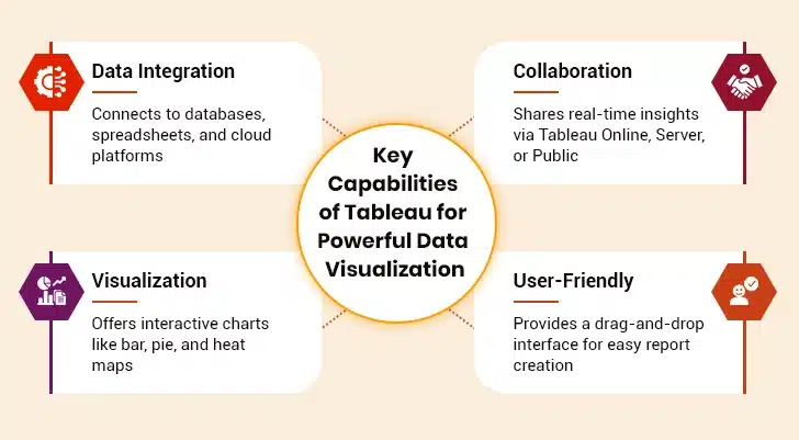
1. Data Connection and Integration
Tableau excels in data connectivity, allowing users to connect and fetch data from disparate sources, including local files, relational and non-relational databases, spreadsheets, data warehouses, cloud-based platforms, and web services. This feature ensures users can access and analyze data from various sources, providing a holistic view of the information. The interesting thing to note is that Tableau also supports an array of data connectors such as Presto, MemSQL, Google Analytics, Google Sheets, Dropbox, Salesforce, SQL Server, Cloudera, Hadoop, Amazon Athena, and many more.
2. Sharing and Collaboration
Tableau makes it simple to collaborate with other users by instantly sharing data in real time as sheets, visualizations, and dashboards to platforms like Tableau Online, Tableau Server, or Tableau Public. This facilitates easy data sharing and collaboration with internal and external stakeholders, allowing users to disseminate insights effectively and get reviews or feedback in real time, resulting in a better overall analysis.
3. Rich Visualization Capabilities
Tableau offers a rich library of data visualization options, including line charts, bar charts, pie charts, Gantt charts, motion charts, scatter plots, heat maps, tree maps, geographic maps, and much more. These are highly customizable, enabling users to represent data as rich and interactive visualizations effectively.
4. User-Friendly Interface
Another impressive feature of Tableau that makes it stand out in the market is its user-friendly interface. It offers a drag-and-drop functionality, making it accessible to users with varying technical skills and backgrounds. With its intuitive design, users can effortlessly create simple and complex data visualizations, making it an ideal choice for business and data professionals.
How to Make Data Democratization a Reality with Tableau
Key Advantages of Using Tableau for Data Visualization
I. Cost-efficient
Tableau is a relatively affordable data visualization software solution compared to its counterparts, such as Qlik and Business Objects, making it an attractive choice for small and mid-sized businesses. It offers an array of licensing options to meet diverse organizational needs. By providing flexible licensing models, this data visualization tool ensures that organizations of varying sizes can leverage their capabilities without breaking the budget.
II. Mobile Responsive
In the mobile-first world, it’s imperative to have data visualization software that allows users to access or view reports and dashboards from their smartphones. Tableau is one such tool that allows users to access and interact with visualizations across all mobile devices, including smartphones and tablets. The mobile responsiveness optimizes the data reports tailored to the device size and serves as the best viewing option for decision-makers, enabling them to access critical insights on the go.
III. Integration With Multiple Scripting Languages
Tableau integrates seamlessly with popular statistical and programming languages to enhance the computation speed while overcoming the performance issue. For instance, users can take the load off the visualization software using Python scripts and perform data cleansing tasks easily. The important thing to note is that Python is not a native scripting language of Tableau. However, users can still import the visual packages of the language. Besides this, Tableau’s integration with scripting languages empowers users to perform predictive modeling and advanced data analytics directly within the data visualization software to gain deeper insights and make more informed data-backed decisions.
Real-World Tableau Use Cases Across Industries
a. Retail
Retailers and online stores manage high amounts of data, from sales transactions to consumer preferences. Tableau assists these companies in analyzing trends, predicting demand, and tailoring marketing strategies.
Merchants typically employ Tableau dashboards to monitor sales performance across various outlets. They can determine which products sell most in particular regions and adjust their inventory accordingly.
Tableau also supports pricing tactics. Customers can compare competitors’ prices and set their own to remain within the market. Rewards programs are more effective when companies apply segmentation using Tableau according to purchasing history and level of engagement. This segmentation facilitates targeted promotions and customized discounts.
b. Finance and Banking
Banks regularly handle sensitive and intricate information. Tableau enables financial institutions and analysts to track transactions, analyze risks, and identify fraud accurately.
Fraud prevention is a vital use case. Banks employ Tableau in data visualization to detect transaction trends and raise red flags in real time for suspicious activities. Through integrations with machine learning models, Tableau anticipates and forecloses on fraud before it happens. Credit card service providers use Tableau to analyze credit spending patterns and spot potential security breaches.
Regulatory compliance becomes easier with Tableau. Financial institutions are subject to stringent regulations, and Tableau effectively monitors compliance metrics. The system automatically generates reports to ensure compliance with all regulatory mandates.
c. Manufacturing
Manufacturers use Tableau to monitor machine performance, detect maintenance requirements, and decrease downtime. Tableau also assists with inventory management. Businesses can see stock levels in different warehouses and schedule restocking to maximize efficiency. This avoids overstocking and saves storage expenses.
Quality control improves with Tableau through defect rate and production inconsistencies analysis. It enables manufacturers to take immediate corrective action. Through real-time data from IoT sensors, Tableau makes smart factories possible, in which processes are monitored and enhanced periodically.
Using Tableau, manufacturing firms can raise productivity, reduce costs, and ensure high-quality standards, improving business results.
d. Education
Schools and educational institutions produce copious amounts of data from student performance, faculty management, and administrative processes. Data visualization in Tableau helps teachers enhance learning outcomes and maximize resources.
Administrative effectiveness also increases with Tableau. Schools monitor faculty workloads, class usage, and budgetary allocation.
Tableau also accelerates research analytics. Universities employ it to analyze big data for academic research, allowing data-driven findings. Education policymakers utilize Tableau to analyze national and regional education trends.
e. Telecommunications
Telecommunications involves enormous datasets from call records, Internet use, and customer interactions. Tableau assists telecommunication companies in analyzing data to enhance customer service and maximize network performance.
Another key use is network performance monitoring. Analyzing data from cell towers and broadband services helps companies determine network outages and maximize signal strength. This results in improved service quality.
Tableau also assists in revenue and pricing analysis. Telecommunications operators apply it to monitor revenue patterns, compare various price plans, and streamline billing configurations for the highest profitability.
f. Energy and Utilities
Energy and utility companies deal with complex data regarding power consumption, grid performance, and sustainability initiatives. Tableau helps these companies analyze energy usage patterns, reduce waste, and improve efficiency.
Data visualization using Tableau also facilitates renewable energy management. Businesses examine solar and wind energy generation patterns to forecast production and maximize energy storage. This aids in efficiently balancing supply and demand.
Customer billing and usage analysis is enhanced through Tableau. Utility firms monitor domestic energy usage, identify inefficiencies, and provide customized energy-saving recommendations.
Another realm where Tableau is useful is environmental compliance. Firms use it to monitor carbon output, measure sustainability objectives, and maintain regulatory compliance.
By using Tableau in data visualization, energy firms can make operations more efficient, minimize expenses, and create a cleaner future.
The Eight-Step Guide to Creating Stunning Visuals from Raw Data Using Tableau
Step 1: Install and Set Up Tableau
The journey to creating rich visualizations from raw data begins with Tableau installation and setup.
Step 2: Connect to Data
Tableau is designed to work with disparate data sources, including databases, spreadsheets, data warehouses, cloud-based platforms, web services, and more. To get started, click on “Connect to Data” and select the data source to establish the connection.
Step 3: Prepare Data
Leverage the data preparation tools to cleanse and shape data. Remove duplicates, handle missing values, and ensure the dataset is well-structured.
Step 4: Build a Worksheet
Now, start creating visualization by dragging and dropping relevant fields from the data source onto the Rows and Columns. Select the type of data visualization (e.g., scatter plot, histogram, bar chart, Gantt chart) from the Show Me panel.
Step 5: Customize Visualizations
Customize the appearance of visualizations by adjusting fonts, colors, labels, and formatting. Add captions and titles to make visualization more informative.
Step 6: Create Tableau Dashboards
To present multiple visualizations in a single view, users can simply create dashboards by clicking on the “Dashboard” tab”, dragging worksheets onto the dashboard canvas, and arranging them as needed.
Step 7: Implement Storytelling
Use the “Story” tab to create compelling data narratives by combining worksheets and dashboards. Organize visualizations in such a manner that they resonate with the audience.
Step 8: Publish and Share
Save the Tableau worksheet and share it with other stakeholders by publishing the same to the Tableau Server, Tableau Online, or export it as a Tableau packaged workbook.
Challenges in Data Visualization with Tableau and How to Overcome Them
Effective data visualization in Tableau comes with its challenges. Here are common issues and practical ways to overcome them.
I. Slow Performance with Large Data Sets
Data visualization using Tableau can slow down when handling large datasets. Queries take longer, and dashboards may lag. This affects user experience and decision-making.
One way to fix this is by using data extracts instead of live connections. Extracts store a snapshot of the data, making queries faster. Another method is optimizing data sources by removing unnecessary columns and filtering data before importing.
Using aggregations and indexing can also improve performance. Limiting the use of high-cardinality dimensions helps Tableau process data efficiently. Avoid using too many real-time calculations, as they slow down rendering.
II. Complex Dashboard Layouts
A cluttered dashboard makes data hard to understand. Users may struggle to find insights quickly.
Keeping dashboards simple and clean improves readability. Use consistent fonts, colors, and chart types for a better user experience. Avoid overloading dashboards with too many visualizations. Instead, use multiple dashboards with navigation buttons.
Applying white space helps in organizing elements properly. Providing tooltips and annotations makes it easier to interpret data.
III. Difficult Data Blending
Data blending allows combining multiple data sources. However, incorrect blending leads to mismatched or incomplete data.
To avoid this, always check that common fields match precisely. Ensure that fields have the same data type and format. Using relationships instead of joins in Tableau can help. Setting filters before blending prevents unwanted data duplication.
IV. Limited Customization Options
Tableau has preset chart styles, which may not always fit user needs. Some users require more customization for specific reports. Using calculated fields allows for personalized metrics. Parameters help in creating dynamic visualizations. Applying dual-axis charts and advanced formatting can enhance designs.
V. Confusing Color and Chart Choices
Poor color schemes make visualizations hard to interpret. Choosing the wrong chart type leads to misunderstandings. Following best practices in data visualization with Tableau improves clarity.
- Use contrasting colors for easy distinction.
- Select charts based on data type, such as line charts for trends, bar charts for comparisons.
- Apply color legends to avoid confusion.
VI. Data Security and Access Issues
Sensitive data must be protected in business reports. Tableau users need proper access control. Implement row-level security (RLS) to restrict data views. Using permissions and authentication ensures only authorized users access reports.
VII. Difficult Calculated Fields
New users struggle with Tableau’s formulas. Writing complex calculations can be challenging. Learning basic functions like IF, SUM, and LOD expressions helps. Using Tableau’s calculation editor provides syntax suggestions. Referring to online Tableau forums helps troubleshoot errors.
VIII. Problems with Real-Time Data Updates
Live connections may slow down reports, especially with large datasets. Using scheduled extracts balances speed and data freshness. Optimizing data source refresh intervals ensures up-to-date insights.
IX. Inconsistent Data Formatting
Different data sources may have inconsistent formats. This causes errors in analysis. Always clean and standardize data before importing. Use Tableau Prep for easy data formatting.
X. Limited Mobile Responsiveness
Some Tableau dashboards don’t display well on mobile devices. Creating device-specific layouts ensures proper scaling. Using automatic dashboard resizing helps in mobile optimization.
These solutions help improve data visualization using Tableau, making reports more straightforward and effective.
Summing Up
Tableau is not just another data visualization tool, it is the compass that allows users to identify trends, uncover hidden patterns, and discover opportunities that would otherwise remain hidden. In other words, Tableau empowers users with the ability to navigate through the intricacies of raw and unstructured data to cut through the noise and lead with data-driven confidence. If you are also planning to embrace Tableau as your data visualization ally, it’s wise to seek end-to-end consultation from a reliable BI and Data Analytics partner that can help you streamline operations, enhance customer experiences, and seize untapped opportunities.


