

In today’s era of data-driven decision-making, presenting intricate information clearly and concisely is a vital skill. Both business leaders and analysts aim to convert raw data into impactful visual formats that reveal insights that drive strategic decisions. To achieve this, many organizations are turning to advanced technologies to improve their reporting and visualization capabilities.
Effective visualizations must strike a balance between visual appeal and functionality. Well-designed visualizations enable quicker understanding and foster better collaboration within teams. Businesses leveraging robust data visualization techniques have reported up to a 25% boost in audience comprehension and retention.
Moreover, the ever-evolving business landscape demands tools that adapt to shifting requirements. Mastering these tools is just as important as selecting the right ones. This blog outlines the key types of Power BI dashboards and how to make them.

What is a Microsoft BI Dashboard?
A Power BI dashboard is a single-page document that uses visualizations to tell a story. This page, often called a “canvas,” includes key data highlights. Since it’s limited to just one page, it doesn’t show all the details, but users can access related reports for more information. Dashboards are exclusive to Power BI Service and cannot be created on Power BI Desktop.
Why Choose Microsoft BI?
1. User-Friendly Interface
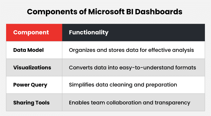
Power BI features an intuitive interface that makes dashboard creation straightforward. Its drag-and-drop tools enable users to create interactive dashboards and reports effortlessly, even without advanced technical skills.
2. Time-Saving Templates
Power BI simplifies the creation and utilization of a wide range of reporting templates. These templates can be saved and shared across different teams and departments.
This helps in:
- Streamlining workflows
- Drastically reducing the time and effort spent on reporting
- Enhancing internal efficiency
3. Seamless Integration with Multiple Data Sources
One of Power BI’s standout features is its ability to integrate with numerous data sources. Power BI connects with diverse Microsoft products, external tools, data files, and server databases. By combining these, businesses create comprehensive and reliable reports using data from various sources through its powerful analytics platform.
4. Unmatched Excel Integration
Power BI is widely recognized for its adaptability and user-friendly design, a key advantage of the platform. This makes it easy for both new and experienced users to get started.
For organizations relying on Excel for reporting and analysis, Power BI ensures a seamless transition by offering robust Excel integration. Businesses connect their existing Excel queries, data models, and reports to Power BI without needing to learn a new tool or language, allowing them to utilize its advanced features.
5. Regular Updates
Microsoft frequently releases software updates for Power BI. These updates ensure that Power BI’s desktop application remains cutting-edge with the latest features and enhancements.
Moreover, Microsoft actively listens to user feedback, often incorporating suggestions into new updates, which drives continuous improvement and innovation.
Types of Power BI Dashboards
I. Strategic Dashboards
Strategic dashboards are meticulously crafted to deliver top-level insight. They enable data visualization through charts, graphs, scorecards, and more. These power BI dashboards further align functions with financial metrics, market trends, customer satisfaction, and growth opportunities. They facilitate monitoring business health, identifying risks or potential opportunities, and optimizing resource allocation.
Types of Strategic Power BI Dashboards
Below are prominent examples of business intelligence dashboards categorized under the strategic dashboard umbrella.
a. CEO Dashboard
The CEO dashboard offers a comprehensive view of the company’s health. It tracks growth trajectories and monitors KPIs essential for informed decision-making at the highest level.
Key benefits:
- Offers the executive leadership team a three-pane view of operations.
- Facilitates data-driven discussions and strategy sessions in boardrooms.
- Helps businesses foresee what’s coming and make necessary changes.
b. COO Dashboard
A COO dashboard focuses on optimizing company operations by ensuring efficient resource utilization and maximizing productivity.
Key benefits:
- Displays how human, financial, and material resources are distributed across departments or tasks.
- Highlights the expense of completing tasks or processes, helping identify cost-saving opportunities.
- Measures the volume of work completed within a set timeframe, gauging efficiency.
c. Customer Satisfaction Dashboard
This dashboard analyzes customer feedback, enhances customer experience, and shapes customer-focused strategies.
Key benefits:
- Enables feedback segmentation by demographics like age, location, or preferences to help businesses better understand customer perspectives.
- Filters feedback by themes, such as product or service quality, to focus improvement efforts where they matter most.
II. Operational Dashboards
Operational dashboards focus on tracking real-time metrics and overseeing daily business processes, ensuring seamless operations and timely interventions when necessary.
Types of Operational Dashboards
Below are prominent examples of Microsoft BI dashboards categorized under the operational dashboards umbrella:
a. Supply Chain Overview Dashboard
This Microsoft BI dashboard offers a bird’s-eye view of supply chain processes, enabling teams to manage suppliers, deliveries, and lead times effectively.
Key benefits:
- Monitors the time taken from order placement to delivery, identifying bottlenecks in the supply chain.
- Tracks whether the correct items and quantities are consistently delivered.
- Evaluates suppliers based on reliability, quality, and timeliness, helping prioritize trustworthy partners.
- Enables quick supplier performance evaluation and facilitates issue resolution with underperforming vendors.
- Tracks lead times and order accuracy to minimize delays and improve operational reliability.
b. IT Infrastructure Dashboard
This dashboard offers an in-depth view of IT systems. It helps ensure stability, minimize downtime, and maintain operational efficiency.
Key benefits:
- Tracks how quickly servers respond to requests, reflecting network efficiency.
- Logs occurrences of system downtime, enabling teams to prevent future disruptions.
- Instantly display network status, server response times, and other critical metrics.
- Showcases historical system performance to identify patterns and plan for scalability.
III. Analytical Dashboards
Analytical dashboards are crafted for deep data analysis, advanced insights, and trend identification. They empower users to make informed, data-driven decisions.
Types of Analytical Dashboards
Below are prominent examples of business intelligence dashboards categorized under the analytical dashboard umbrella.
a. Profit & Loss Dashboard
This dashboard displays income, expenses, and net profit trends, providing a clear financial overview.
Key benefits:
- Offers a broad view of profitability over time, enabling better cost management and revenue planning.
- Tracks trends, helping leaders allocate resources effectively and refine financial strategies.
- Allows users to explore data by region, department, or quarter, uncovering specific trends for a more focused analysis.
b. Product Development Dashboard
This dashboard tracks R&D project progress, costs, and milestones to streamline product development.
Key benefits:
- Provides an overview of project phases and milestones for clear process tracking.
- Ensures products launch on time and within budget and enables efficient resource management.
IV. Tactical Dashboards
Tactical dashboards are designed to track performance and optimize processes. They focus on achieving medium-term objectives by helping teams make data-driven adjustments for steady progress.
Types of Tactical Dashboards
Below are prominent examples of business intelligence dashboards categorized under the tactical dashboard umbrella.
a. Project Management Dashboard
This dashboard helps monitor project progress, manage tasks, and allocate resources using real-time data and clear visuals.
Key benefits:
- Keeps projects on schedule by highlighting milestone statuses.
- Optimizes resource usage with clear allocation visuals.
b. Employee Performance Dashboard
This dashboard offers insights into team and individual productivity, allowing leaders to monitor overall performance.
Key benefits:
- Helps identify top-performing products or services.
- Supports resource reallocation to high-performing channels.
How to Create Power BI Dashboards?

Step 1: Download and Install Power BI Desktop
- Visit Power BI’s Website: Head to the official Power BI site.
- Download: Click the “Download Free” button under Power BI Desktop.
- Install: Follow the installation steps to set up Power BI Desktop on your system successfully.
Step 2: Connect to Data Sources
- Launch Power BI Desktop: After installation, open the application.
- Get Data: Select the “Get Data” option from the Home ribbon. Power BI supports a range of data sources, including SQL Server, Excel, Azure, and more.
- Select Data Source: Choose the appropriate data source. For example, if you’re working with Excel, click on “Excel,” browse for the file, and open it.
- Load Data: Select the tables or sheets you want to import, then click “Load.”
Step 3: Transform and Clean Data
- Power Query Editor: Click “Transform Data” to open the Power Query Editor.
- Clean Data: Use the available tools to clean and transform the dataset. This may include filtering rows, splitting columns, removing duplicates, and more.
- Apply Changes: Once the data is prepared, click “Close & Apply” to save your changes and load the data into Power BI.
Step 4: Create Visualizations
- Report View: Navigate to the Report View to build visualizations.
- Select Fields: Open the Fields pane and choose the data fields you want to use.
- Choose Visualization Type: In the Visualizations pane, select the type of chart or graph to create (e.g., bar chart, pie chart, map).
- Drag & Drop: Drag fields from the Fields pane into the visualization to populate it with data.
- Customize Visuals: Use the Format pane to personalize visualizations by adjusting colors, labels, and other settings.
Stay on Top of Your Metrics with Real-Time Power BI Dashboards
Step 5: Build the Report
- Add Visuals: Repeat the visualization creation process to add charts, tables, and graphs to your report.
- Arrange Visuals: Drag and resize visuals on the canvas to form a well-organized layout.
- Use Filters & Slicers: Add slicers for interactive data filtering by dragging a field onto the canvas and selecting “Slicer” in the Visualizations pane.
- Add Text Boxes & Shapes: Enhance your report with text boxes for annotations and shapes for design elements or titles.
Step 6: Publish to Power BI Service
- Save Your Work: Regularly save the Power BI Desktop file (.pbix) to avoid losing progress.
- Sign In: Click “Sign In” in the top-right corner of Power BI Desktop and enter your credentials.
- Publish: Select “Publish” from the Home ribbon and choose the desired workspace in Power BI Service.
Step 7: Create the Dashboard
- Access Power BI Service: Open a web browser and go to Power BI Service.
- Navigate to Workspace: Go to the workspace where the report was published.
- Open Report: Click on the published report to view it.
- Pin Visuals: Hover over a visual and click the pin icon to add it to a dashboard. Repeat this step for every visual you want to include.
- Create a New Dashboard: If creating a new dashboard, assign it a name when prompted.
Step 8: Customize the Dashboard
- Edit Dashboard: Open the dashboard in edit mode to make adjustments.
- Arrange Tiles: Drag and resize tiles to create a layout emphasizing key metrics.
- Add Tiles: Click “Add Tile” to include elements like KPIs, text boxes, images, or web content.
- Set Alerts: Configure alerts for tiles to receive notifications when data meets specific thresholds. Click the ellipses (…) on a tile and select “Manage Alerts.”
Step 9: Share the Dashboard
- Share Dashboard: Click the “Share” button at the top of the dashboard.
- Invite Users: Enter the email addresses of colleagues or stakeholders and assign them viewing or editing permissions.
- Generate Link: Alternatively, create a shareable link to send to users.
- Embed Dashboard: Use the embedded code provided by Power BI Service to integrate the dashboard into an app or website.
Step 10: Monitor and Update
- Monitor Usage: Use dashboard metrics in Power BI Service to track how users interact with it.
- Refresh Data: Schedule automatic data refreshes to ensure the dashboard displays up-to-date information. Go to dataset settings in Power BI Service to configure the refresh schedule.
- Make Updates: Collect feedback from users and make improvements by updating the Power BI Desktop file and republishing the report. Changes will automatically reflect on the dashboard.
Best Practices for Building a Power BI Interactive Dashboard
| Keep It Simple | Avoid overloading your dashboard with excessive visuals or complicated elements. Focus on core metrics and insights that align with your goals. Simplicity makes the dashboard clearer and easier to use. |
| Design for Your Audience | Consider stakeholders who will use the dashboard. Understand their preferences and needs. Customize visualizations and interactivity to offer a relevant and user-friendly experience. |
| Test and Improve | Regularly perform usability tests and comparisons with end users. Identify any weak points or challenges. Adapt your design based on feedback and evolving business demands. |
| Provide Training and Documentation | Create easy-to-follow guides or tutorials. Help users understand how to navigate, interact, and make decisions using the Power BI interactive dashboard. Clear instructions drive better adoption and efficiency. |
Conclusion
Microsoft Power BI dashboards tell a story that reveals various insights and patterns. To build engaging dashboards in Power BI, utilize available data repositories, build captivating visuals, and include features that enrich the viewer’s experience. By adding slicers, drill-throughs, and unique visuals, you design an appealing and functional dashboard. These elements help users extract meaningful insights and make informed choices.
Sticking to solid design principles ensures your Power BI dashboards deliver actionable outcomes, boost efficiency, and foster collaboration. The right blend of simplicity, creativity, and functionality will make your dashboards a powerful decision-making tool.